
The challenge
Hopscotch Studio designed comfortable, colourful shoes for adults who like to play. Their branding said otherwise: muted tones, a neat serif logo and product shots on grey. It looked like a premium homeware label, and the people who'd love the shoes scrolled straight past.
The founders, Marta and Yusuf, asked for something specific: a brand that looks like the shoes feel, and a launch campaign to prove it.
Our approach
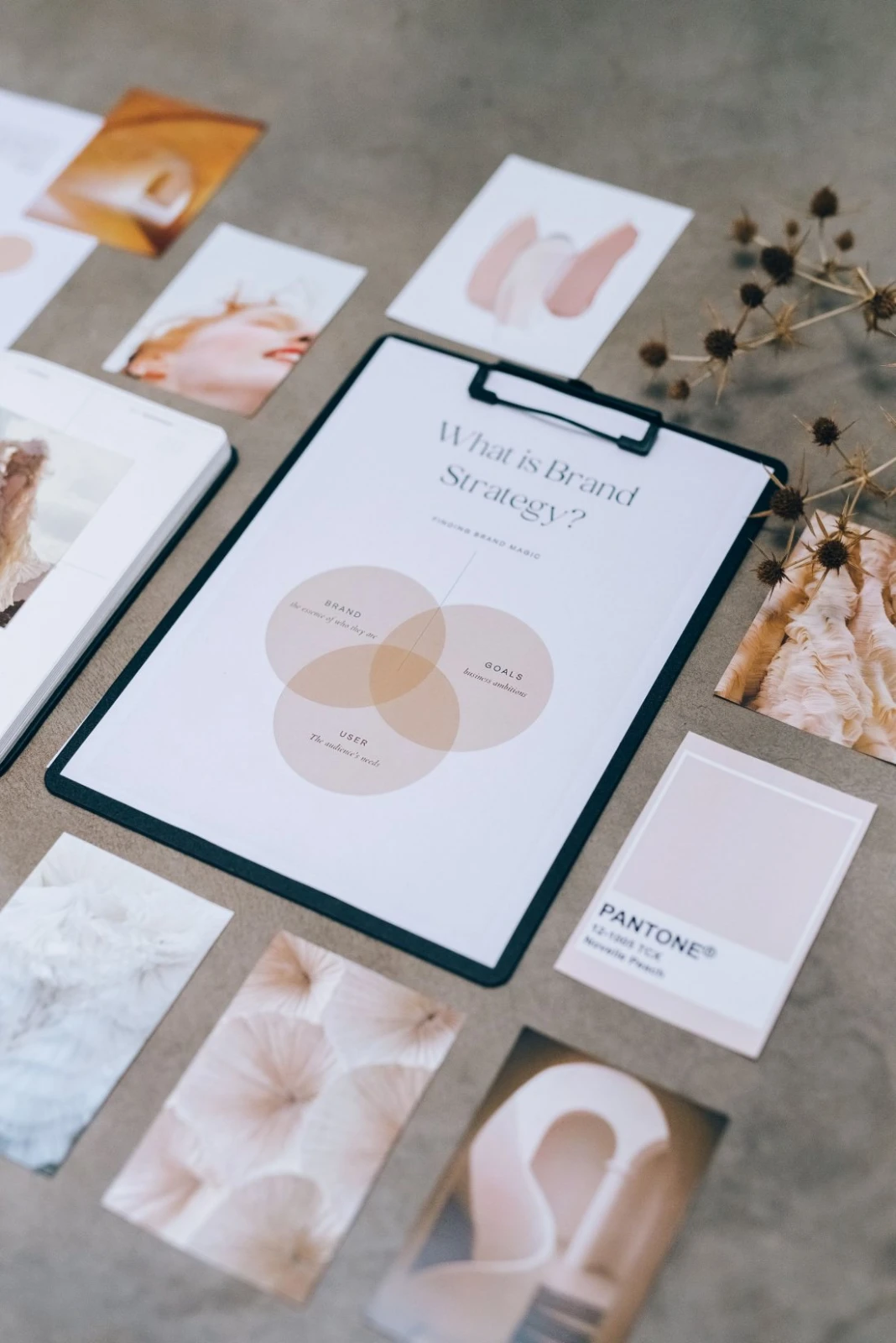
We ran a short strategy session, then started with the most important question: what would the brand look like if it was allowed to have fun? Three ideas came out of the room.
- Play as a system. A hopscotch grid became the mark, the layout rule and the pattern, so every asset felt connected.
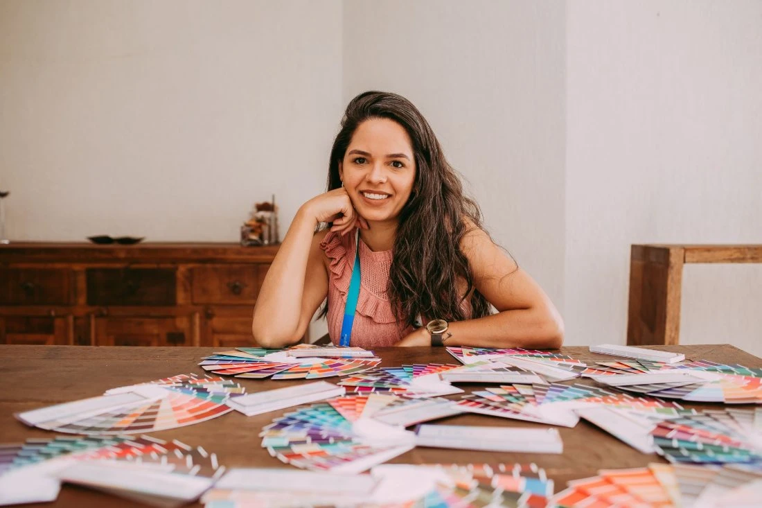
- Colour for the feed. Four bright shades chosen to sit next to each other on a phone screen, with a simple rule for which one leads.
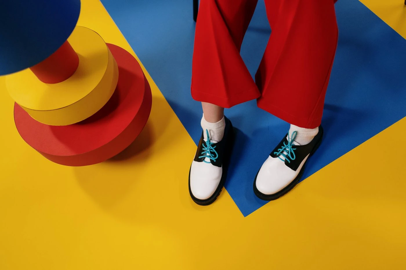
- The product as the punchline. A two-day shoot on coloured paper, where every shoe got a small, silly scene.
We stopped designing for a gallery and started designing for a Saturday afternoon. The shoes finally looked like they belonged to someone who laughs. Leo Hart, design lead at Hollr
The result
The new identity and the campaign went live together. Reach rose by 212% in the first three months, the account gained 48,000 new followers and average order value climbed to 2.4 times its previous level as shoppers added a second pair in a second colour.
- Stocked by two independent shops within six weeks
- The campaign shot reused in 60 pieces of content
- Returns down by a fifth after sizing notes moved into the new packaging