
The challenge
Fieldnote's planners were beautifully made and quietly sold. The old brand was a plain kraft box, a thin logo and a lot of white space. Fans loved the paper, but nobody picked the planner up in a shop, and nobody posted it. For a product that sits on a desk all year, it had very little to say.
The founder, Theo Mensah, set a clear goal: sell out the autumn print run at launch without discounting, and win people who had never heard of the brand.
Our approach
We spent a morning in the workshop, then talked to twelve people who buy a new planner every year. They weren't buying organisation. They were buying a fresh start, and they wanted the object to feel like one.
- A brand with a voice. Short, warm lines on the covers and inside the pages, with a small “plan like you mean it” note on every spread.
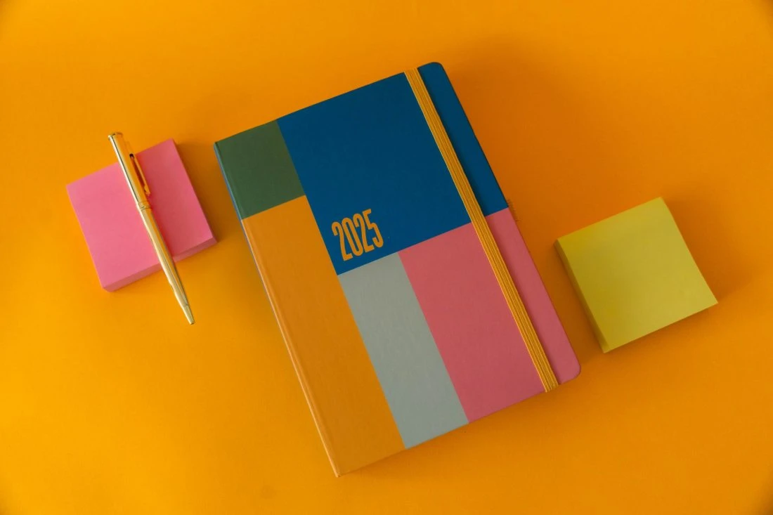
- A box worth keeping. A bright marigold sleeve, a folded-corner mark and a sticker sheet tucked inside, so unboxing was part of the product.
- A launch week with a countdown. Teaser content, a planner-flip video series and one launch morning, with early access for the mailing list.
People don't buy a planner to be organised. They buy it to feel like next month will be better. We designed for that feeling. Kemi Adeyemi, creative director at Hollr
The result
The new brand and packaging launched nine weeks after kickoff. The first 4,000 planners sold at launch, and 62% of buyers were new to Fieldnote, which is far above what the shop saw from its usual mailing-list launches.
- Autumn print run sold out in eleven days, with a reprint ordered
- Unboxing posts up from a handful a month to more than 300 in launch week
- Three independent stationery shops asked to stock the range